Something about the scene was so appealing, or maybe it was a combination of everything: the brick, the ivy, the blue trim. I love how the little garden is thoughtfully tended with all of the elements working so nicely together. The red flowers pick up the brick tones, the blue pots repeat the trim and door color and the additional greenery adds interesting texture. There is no one thing that stands out. Instead, everything works together to create a lovely front entry.
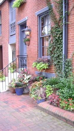
I snapped this picture walking down a residential street in the Federal Hill section of Baltimore. Actually, I took the picture the second time I passed this townhouse. My friends watched me as I took a picture of what to them was some random house in a neighborhood I don't live in. I tend to do this.
Something about the scene was so appealing, or maybe it was a combination of everything: the brick, the ivy, the blue trim. I love how the little garden is thoughtfully tended with all of the elements working so nicely together. The red flowers pick up the brick tones, the blue pots repeat the trim and door color and the additional greenery adds interesting texture. There is no one thing that stands out. Instead, everything works together to create a lovely front entry. One of my favorite colors tends to get a bad rap. Yes, not everyone can appreciate the beauty of orange. I get it. Sometimes a "punch of color" can feel like a smack in the face; but there's no need to avoid orange. Especially when it has the ability to add so much life to a room. And, for you trendsetters, it's going to be a very popular color come fall. Let's start with some things to avoid. Orange really does not play nicely with black--except on Halloween. A better alternative is brown or grey. With brown, don't go adding too much gold to the palatte or you run the risk of having a very "Harvest-y" look. You don't want Halloween every day, but you don't want Thanksgiving either. The grey is bit more unexpected but a charcoal grey sofa with a few orange pillows (like the ones here from Room and Board) would look fantastic. Another thing to watch out for: orange with other bright colors. It's fun and playful, but it can also read a little harsh. Know that if you pair bright colors like this with white, it's better to do it mostly in solids or cleaner patterns (like a stripe). A combination of bright color + busy pattern grows old very quickly. Orange also pairs really well with navy, cream, and tan. A bathroom with simple tan or cream tiles "wakes up" with just a couple of additions on orange--hand towels, tray to corral soaps, etc. I've included a few other other fun orange accents to inspire you below. |
AuthorChristine Schwalm is an Interior Designer and Visual Merchandiser based in Los Angeles. This space will keep you updated on what's going on with CSD along with some ideas to inspire you. Go here for more information about pricing and services and here to make an appointment. Archives
January 2017
Categories
All
|