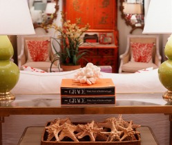
Red orange and chartreuse with crisp white 
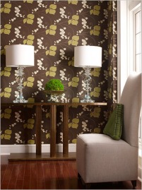
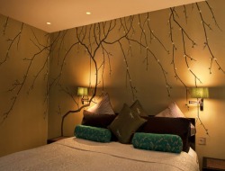
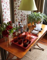
I've been working in Stamford for almost 2 years now and one of the best Connecticut "finds" I've learned about is a shop called Dovecote in Westport. Don't ask me where exactly that is, all I know is Connecticut is a big rectangle and I go to the bottom left corner of it 5 days a week. But between the published pictures of their projects in more local magazines and these images from their site, I'm inspired to make the trip.
No, this is not an April Fool's joke. I read an article in the Times today that showcased wallpapers from York Wallcovering inspired by Disney's Fantasia. You remember that one, right? Old Walt's acid trip movie? Anyway, the designers used original artwork from the film to create some really beautiful papers. For a while there, wallpaper really fell out of fashion. The late 70's and 80's provided some truly frightening wall treatments so it is no surprise that a sea of taupe reigned throughout the 90's. But enough time has passed for our memories to clear and for wallpaper to have another turn on our walls. Unlike painted walls, which can easily be changed with a few cans of primer and paint, wallpaper is a commitment. So if you're going to go through the time and expense, you'd better pick something fabulous. And I found something fabulous at the AD Home Show. Last saturday, I enjoyed the beautiful weather by strolling down 5th Avenue in Manhattan, checking out all the spring windows. Hey, a girl can dream, right? I almost walked passed the new(ish) Tommy Hilfiger store when I remembered reading about the fantastic store design. I decided to stop in and it did not disappoint. House Beautiful August 2008 As I've mentioned in previous entries, my current lease does not allow for painting the walls unless I'm prepared to repaint the exact same shade of "renters beige". No, thank you. So, in addition to my wallpaper panels that I plan to hang near my entry, I wanted to treat the wall behind my bed. I used this picture from an article in House Beautiful as my inspiration. The panels are done, by the way, but I haven't hung them yet. They were really easy to do and look great. Spring is feeling very far off. While looking for cheerful inspiration as I plan out my new apartment, I came across these photos from a friend's online album from her visit to Provence. What I love about the Provence style is that it combines the ease of rustic finishes with beautiful bright color. I appreciate Sweedish/Gustavian design, but the ethereal quality it goes for can come off a little cold. The combination of rich pigmented colors and warm neutrals is much more inviting to me. Pretty popular with Van Gogh, too, as the cafe pictured here served as the inspiration for The Café Terrace on the Place du Forum. Since winter has decided to officially arrive (even though it unofficially arrived two days earlier with a foot of snow), it's a good time to stay in and cozy up with some movies. I'll admit that I don't watch movies like a regular person. Sure, I care about plot and character development and all that stuff; but what I really want to know is where did the set designer find that awesome lamp.
Tom Ford's new film A Single Man is getting a lot of buzz--and not just for the acting performances. This film (with some help from Mad Men) may bring back the conversation sofa. And not just to the Mid Century Modern hipsters who already found one on craigslist. I added two new room settings that I did for the day job to the Retail Projects section of my portfolio. You may notice as you click through that one room looks familiar. I moved a living room setting from a larger to a smaller space. For those of you planning to move (or who have recently moved), this will give you some ideas about repurposing your existing pieces. For instance, the artwork over the sofa used to be above the bed. It's important to rethink your items as your needs and lifestyle changes. I'll go through both new settings more thoroughly in upcoming entries to give you insight into the design rationale I used to complete the projects. I saw these pictures in the November issue of House Beautiful and they really struck a chord with me. I think it was the combination of elements that I like so much. First off, the green/red complimentary color scheme (which I have in my own apartment) is terrific. The bright apple green gives so much life. Second, that Jacobean floral fabric is fantastic. It's the type of thing that can only be used in small doses or it will completely overwhelm a space. Third, those glasses! They have sort of an animal print feel to them and it just adds a lot of warmth. Lastly, the table is such a great blend with Phyfe inspired pedestal legs but a Mid Century modern teak color finish. There are lots of great ideas to take away from the new room setting I did for the day job. First, using 2 smaller scale sofas facing each other is perfect for creating balance. This is set up works great if you've got 2 focal points across from each other (fireplace/window and TV). The sofas here are in a neutral khaki which is the perfect backdrop for the red pillows and artwork. Think of it like wearing a tan coat with a red scarf. |
AuthorChristine Schwalm is an Interior Designer and Visual Merchandiser based in Los Angeles. This space will keep you updated on what's going on with CSD along with some ideas to inspire you. Go here for more information about pricing and services and here to make an appointment. Archives
January 2017
Categories
All
|