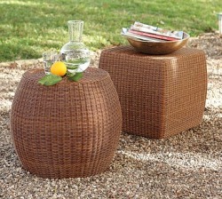
Rattan Accent tables from Pottery Barn 
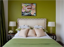
A common phrase on design shows and in shelter magazines is "bringing the outside in". Most of the time that refers to a nature inspired color palatte or the addition of plants and greenery to a setting. But as more people start using their decks and yards as their summertime living rooms, companies have stepped up to introduce products that are suitable for both indoors and outdoors. Here are a few great finds.
Anthropologie retail store in London This entry is not so much design as it is gardening. Considering I have the "black thumb of death" (seriously, I managed to kill a catctus), it's a little surprising for me to write about gardening type issues. But one trend that I've noticed in both retail design and backyard design is vertical gardens. Benjamin Moore DIFFA table This weekend I hit up Design Nerd Expo '10--better known to laypeople as the Architectural Digest Home Show--and came away with lots of great ideas and sneak peeks into what's new out there. One element I saw consistently was the use of potted succulent plants grouped en masse as centerpieces. This works out perfectly for several reasons. If you want to get a good deal (and not wind up with the same thing that everyone else has) you've got to travel a little off the beaten path. That means checking out flea markets, Salvation Army and craigslist. It also means checking out some stores that you would never normally consider for furniture. I wrote about that a little while ago (JC Penneys) and today I've got another surprise for you. This fretwork tray table is perfect for those of you wanting to inject a bit of that Hollywood Regency look into your home. Where to find this chic little table? Brace yourselves.......KMart. It only comes in the white finish, but at only $70 (on sale), you would be wise to get on this great deal right now! The Hollywood Regency design trend has been back with us for a minute, spearheaded by the likes of Jonathan Adler and Kelly Wearstler. It is a luxurious look that features high shine and glam details. While the original offshoot of Art Deco style worked around a palatte of blacks and creams, this recent revamp injects bright color. One landing spot for this color is on faux bamboo pieces, such as the Jonathan Adler etagere shown here. Please pardon the brief absence. I've been quite busy with the day job and the apartment hunt (apartment #1 fell through creating all sorts of challenges). But I wanted to share some great pictures from an article in the New York Times.The designer who lives here is renting while his permanent home is being built nearby. He wanted to create something that didn't feel temporary but didn't require a huge investment of time or effort. Designer Daryl Carter's dining room When does something stop being classic and start being trendy? After all, we'd all like to invest in furniture that qualifies as classic--especially expensive furniture. But lately, I feel like I keep seeing the same things in shelter magazines--linen, mohair, neutral colors like grey or mushroom, weathered woods and nickel are just a few examples. It used to be that I'd consider furniture with these features classic; Belgian linen drapes in a stormy grey, mohair sofas in a soft mushroom brown or an old farmhouse style table that's clearly been "loved." Last week I had a meeting in the Flatiron district and decided to check out Restoration Hardware while I was in the area. In addition to having a store full of pieces that seemed totally out of scale to the surrouding dwellings (100"+ sofas? In Manhattan? Really?), I found several pieces of what I call "mass marketed antiques." According to the catalogue, they are genuine salvaged items--iron weights, eyeglass molds, architectural items, etc.--which is why I refer to them as mass marketed and not mass produced. I started paging through this month's House Beautiful over lunch today and stopped 4 pages in when I saw this ad from Lee Jofa. It features their "Nolita" collection from the Groundworks division. Groundworks is the more contemporary fabric offering from Lee Jofa. A few things drew me in to this ad. First off, a delicious medley of fantastic colors--I love orange and purple together. Second, can we talk about the velvet? I won't lie, I'm a big fan. Not as bad as George Costanza, wanting "to drape myself in velvet," but a fan all the same. Nothing says autumn quite like it. Third is the great mix of pattern. There's a large scale floral, a geometric, a mini print and some solids. The largest print has the entire color palatte and all of the supporting fabrics relate to it. Notice, too, the way the curve of the headboard repeats the curve of the floral motif. I would love to have seen more of the geometric pattern, perhaps on a larger pillow, to balance out the floral pattern a bit more. Geometrics and stripes have more staying power because they're easier for the eye to read. Still, this ad is absolutely getting posted on my inspiration board. Right next to my picture of Tim Gunn reminding me to "make it work." One of my favorite colors tends to get a bad rap. Yes, not everyone can appreciate the beauty of orange. I get it. Sometimes a "punch of color" can feel like a smack in the face; but there's no need to avoid orange. Especially when it has the ability to add so much life to a room. And, for you trendsetters, it's going to be a very popular color come fall. Let's start with some things to avoid. Orange really does not play nicely with black--except on Halloween. A better alternative is brown or grey. With brown, don't go adding too much gold to the palatte or you run the risk of having a very "Harvest-y" look. You don't want Halloween every day, but you don't want Thanksgiving either. The grey is bit more unexpected but a charcoal grey sofa with a few orange pillows (like the ones here from Room and Board) would look fantastic. Another thing to watch out for: orange with other bright colors. It's fun and playful, but it can also read a little harsh. Know that if you pair bright colors like this with white, it's better to do it mostly in solids or cleaner patterns (like a stripe). A combination of bright color + busy pattern grows old very quickly. Orange also pairs really well with navy, cream, and tan. A bathroom with simple tan or cream tiles "wakes up" with just a couple of additions on orange--hand towels, tray to corral soaps, etc. I've included a few other other fun orange accents to inspire you below. |
AuthorChristine Schwalm is an Interior Designer and Visual Merchandiser based in Los Angeles. This space will keep you updated on what's going on with CSD along with some ideas to inspire you. Go here for more information about pricing and services and here to make an appointment. Archives
January 2017
Categories
All
|