|
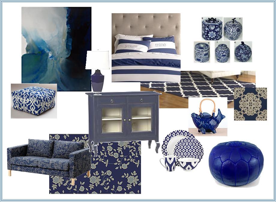
Blue is one of those colors that never really goes out of style. After years of teal, peacock, and Tiffany blue, however, there's a resurgence of cobalt and royal blue in design. I got some great ideas from ZGallerie's site and found lots more browsing online. Most people gravitate towards nautical, but cobalt is beautiful with red (Tobi Farley did a beautiful room in a Richmond show house with this palette), canary yellow or even orange, if you're feeling brave.
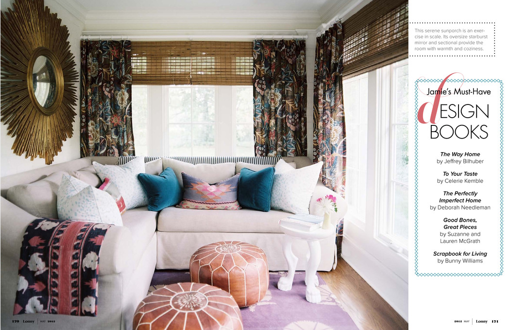
One trend I noticed throughout the new issue of Lonny Magazine were sunburst mirrors. This one here is overscaled and dramatic.
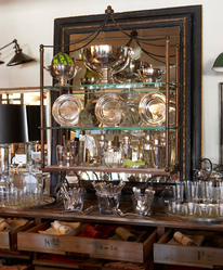
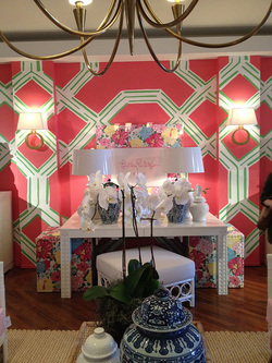
 During the two and half years I spent working out of Stamford, I made a point to check out the shops in nearby Greenwich regularly. They always served as great inspiration for collecting and displaying beautiful pieces. One store, in particular, that always made my "must visit" list is Privet House. This picture at left shows some simple glassware and silver, but so artfully done. And now they're part of the Target "Shops" both online and in stores. Here's a few lovelies I found in coral, my favorite color for spring.  I saw this image over on Furbish's website and wanted to share. It's from Lily Pulitzer's booth at Hight Point. I'm not normally a pink girl, but this particular shade caught my eye. It's really more of a coral-y pink and the overscale trellis pattern is dramatic, to say the least. The heavy use of white on upholstery, furniture and the lampshades help quiet it down. If you look close, there's some pretty detail work on the desk which I bet you could replicate with some O'verlays on an inexpensive painted item. |
AuthorChristine Schwalm is an Interior Designer and Visual Merchandiser based in Los Angeles. This space will keep you updated on what's going on with CSD along with some ideas to inspire you. Go here for more information about pricing and services and here to make an appointment. Archives
January 2017
Categories
All
|


 RSS Feed
