Christine Schwalm Design
  • Home
  • About CSD
  • Services
  • Portfolio
  • Contact CSD
  • Testimonials

One more for the "clever" file

2/27/2010

 
Picture
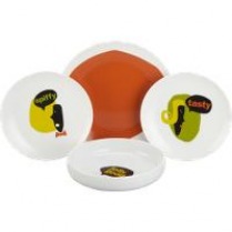
I've already shared my affinity for all things clever so you'll understand why I may just have to order these plates from CB2.  They're little charicatures with comments like "spiffy," "tasty," and "jolly good."  Just in case you're not feeling the love, your plates are there to give you some affirmation. 

To logo or not to logo

2/26/2010

 
Picture
I've decided I want to add a green wool blanket to my bedding ensemble (and I'm using the word ensemble rather loosely).  It's the perfect weight, combined with a flat sheet for comfortable sleeping and is great for my brick red/olive green color palatte.  I have some beautiful crewelwork fabric that I'm planning to turn into a throw blanket for the end of the bed to add a bit of pattern and interest.  I know, I've been big on the do-it-yourself projects lately.  I'm making the most out of this winter weather.


Read More

Textiles on the cheap

2/25/2010

 
Picture
Ikea has a reputation that varies wildly from chief producers of home furnishings crap to saviors from sitting/sleeping/eating on the floor.  It all depends on who you ask.  I do own a few pieces, upgrading to other items over the years as time and budget have allowed, the way most people do.  One department from Ikea I will never outgrow, however, are their textiles.  For simple drapery panels or duvet covers, they are a fantastic source.


Read More

"Grasscloth" wall treatment

2/24/2010

 
Picture
House Beautiful August 2008
As I've mentioned in previous entries, my current lease does not allow for painting the walls unless I'm prepared to repaint the exact same shade of "renters beige".  No, thank you.  So, in addition to my wallpaper panels that I plan to hang near my entry, I wanted to treat the wall behind my bed.  I used this picture from an article in House Beautiful as my inspiration.  The panels are done, by the way, but I haven't hung them yet.  They were really easy to do and look great.


Read More

Liberty of London for Target

2/22/2010

 
Picture
Target is a frequent landing spot for designers looking to expand their line and customer base.  Most of what looks fabulous online looks less so in person.  Or maybe I am just not destined to wear Anna Sui.  But housewares is a whole different ballgame and the Liberty of London line for Target looks playful and springy.  Another design site featured these products this morning as a reminder that as of March 14th, they'll be available to order.  Sadly, I'm not able to find anything online yet, but I'll be checking.  Because there's a peacock print piggy bank with my name on it.

Picture

Project-wallpaper panels

2/19/2010

 
Picture
I've been slowly but surely progressing on getting projects done around the apartment.  Apartment Therapy has a contest they run every spring for smaller dwellings such as mine.  My tiny apartment comes with some challenges, but that's true of most everyone who rents.  My lease does not allow me to paint (or I forfeit part of my deposit) and the current color leaves much to be desired.  So what to do to dress up my boring walls?  Enter, the wallpaper panels.


Read More

Get on it-Gold and Grey

2/16/2010

 
Picture
I shared one of the new room vignettes a few weeks ago that featured a charcoal grey and yellow palatte that is really stunning.  The vine fabric....oh my!  I know the Pantone folks are saying that turquoise is going to be the "it" color for this year, but I think yellow is going to be a contender.  I was reading a favorite design blog last week that featured some of DwellStudio for Target's new line of bedding and pillows.

Picture
Check out the pillows that are part of the new line, too.  That back one is fantastic.  And the texture of the 2nd, with the roses, really great.  Pillows are always an easy, low cost way to participate in a trend without going bankrupt.  So, where have you seen grey and gold lately?

Chic or 178 sq. ft. of stuff

2/11/2010

 
Picture
There are many schools of thought on what makes for tasteful design.  At either end of the spectrum is the "less is more" and the "more is more".  Today's NY Times features the home of a young designer who clearly subscribes to the latter school of thought.  It's a tiny apartment in Brooklyn that is chock full of collectibles, books and assorted items.  Here's my issue--there's virtually nowhere for the eye to rest--especially in the living area.  My eye went straight from the plaid throw on the chair to the simple (and quite lovely) white bedding.  Why?  Because that sofa pattern hurt my eyes!  The room, in my opinion would be much more appealing with either a charcoal grey sofa, perhaps in a wool or linen or something in leather. 


Read More

Surprise source-tray table

2/9/2010

 
Picture
If you want to get a good deal (and not wind up with the same thing that everyone else has) you've got to travel a little off the beaten path.  That means checking out flea markets, Salvation Army and craigslist.  It also means checking out some stores that you would never normally consider for furniture.  I wrote about that a little while ago (JC Penneys) and today I've got another surprise for you.  This fretwork tray table is perfect for those of you wanting to inject a bit of that Hollywood Regency look into your home.  Where to find this chic little table?  Brace yourselves.......KMart.  It only comes in the white finish, but at only $70 (on sale), you would be wise to get on this great deal right now!

NY Times-Designer/client relationship done right

2/8/2010

 
Picture
I look forward to the NY Times articles that feature room redos done on a budget.  They are much more like the projects I work on with my clients.  Also, so many of them have the train wreck drama that makes me cringe.  This week's article was a welcome change of pace.  The clients in the article wanted a Parisian inspired bedroom on a $1500 budget.  One sentence that caught my attention and made so much sense: [The] ideas were offered as suggestions rather than directives, and were accompanied by lengthy explanations.


Read More
<<Previous

    Author

    Christine Schwalm is an Interior Designer and Visual Merchandiser based in Los Angeles.  This space will keep you updated on what's going on with CSD along with some ideas to inspire you.  Go here for more information about pricing and services and here to make an appointment. 
     
    Have a design question?  Need some advice?  Send it here and I'll post the answer in an entry.

    Follow @cmschwalm

    RSS Feed

    Archives

    January 2017
    November 2016
    October 2016
    September 2016
    August 2016
    July 2016
    June 2016
    May 2016
    April 2016
    March 2016
    December 2013
    November 2013
    October 2013
    August 2013
    June 2013
    May 2013
    February 2013
    January 2013
    September 2012
    August 2012
    July 2012
    June 2012
    May 2012
    April 2012
    March 2012
    December 2011
    October 2011
    August 2011
    July 2011
    May 2011
    April 2011
    March 2011
    February 2011
    January 2011
    December 2010
    October 2010
    September 2010
    August 2010
    July 2010
    June 2010
    May 2010
    April 2010
    March 2010
    February 2010
    January 2010
    December 2009
    November 2009
    October 2009
    September 2009
    August 2009
    July 2009

    Categories

    All
    Accessories
    Ad Home Show
    Art Museum
    Baltimore
    Brooklyn
    Cleveland
    Color
    Craigslist
    Day Job
    Design Question
    Detroit
    Fallingwater
    Field Trip
    Flea Market
    Furniture
    Garden
    Get On It
    Holiday
    Ikea
    Inspiration
    Inspriation
    Kansas City
    Lighting
    Lodgings
    Movies
    New Blog
    Ny Times
    Pattern
    Payments
    Paypal
    Philadelphia
    Project
    Redesign
    Showroom
    Target
    Thumbs Down
    Trends
    West Elm

Powered by Create your own unique website with customizable templates.