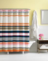
I have pink tile, with black accents in my bath. As such, my shower curtain options are somewhat limited. I've had my current curtain for about 4 years now, and she's had a good run, but it's time to put her out to pasture.
| Christine Schwalm Design |
|
 I spotted this shower curtain in Elle Decor magazine a while back and keep going back to it. Like many Queens NYC residents, I have the ubiquitous pink tile in my bathroom. Thanks for nothing, Mamie Eisenhower. Rumor has it her penchant for pink cursed everyone dwelling in post War construction. Like we weren't cursed enough. I have pink tile, with black accents in my bath. As such, my shower curtain options are somewhat limited. I've had my current curtain for about 4 years now, and she's had a good run, but it's time to put her out to pasture. 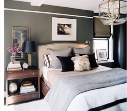 I'm one of many fans of Ron Marvin's design aesthetic. His work is proof that it's possible to design a masculine space without sacrificing style. Take the room pictured left: no bright colors, nothing over the top but still both attractive and practical. One thing that I noticed right away, and that I've brought up several times before, is the mix of materials to create visual interest. Here you've got glass, metal, wool, wood and faux fur (just on the pillow) all in neutral tones. Lonny magazine has more of Ron Marvin's styling tips in their current issue. Image courtesy Lonny Magazine
Blue is one of those colors that never really goes out of style. After years of teal, peacock, and Tiffany blue, however, there's a resurgence of cobalt and royal blue in design. I got some great ideas from ZGallerie's site and found lots more browsing online. Most people gravitate towards nautical, but cobalt is beautiful with red (Tobi Farley did a beautiful room in a Richmond show house with this palette), canary yellow or even orange, if you're feeling brave.
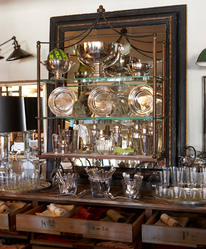 During the two and half years I spent working out of Stamford, I made a point to check out the shops in nearby Greenwich regularly. They always served as great inspiration for collecting and displaying beautiful pieces. One store, in particular, that always made my "must visit" list is Privet House. This picture at left shows some simple glassware and silver, but so artfully done. And now they're part of the Target "Shops" both online and in stores. Here's a few lovelies I found in coral, my favorite color for spring. Remember back in the early 90s when everyone used the word "mint" to describe something extra great? Well, mint is back. I've been seeing it in fashion (lots of mint green skinny jeans and tops in magazines) and House Beautiful had a great little slideshow with inspiration. I wanted to put a few accents together for those who'd like to add just a little bit of minty flavor (oh, that's a bad one) to their home.
I am a big fan of trays. They are great at corraling your stuff and giving at least the appearance of organization. Plus, it's an easy, low commitment way to dip your toe into a certain style. The group above are all from West Elm and are all very reasonably priced. Great variety, right? The goldfish one is actually made of glass and would be adorable as a soap dish.
ps-Are you proud of me for not calling this post "tray chic"? I thought about it, but decided you deserved a little better from me. As a consumer, it's very easy to get locked in to certain stores as "the" place where you buy a particular item. Some people only buy their groceries at Whole Foods or only buy their clothes in Macy's. That brand has earned your business, which is great, but it probably means you're missing out on some interesting alternatives by not shopping around a little. Take the board below, which features items from an unusal source to create a Jonathan Adler inspired "happy chic" look. I found everything at Pottery Barn Teen and almost all of it was on sale.
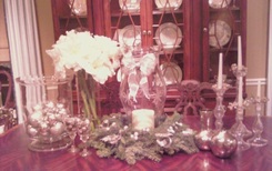 Pretty beaded napkin rings dress up simple glass candlesticks. This trick would work on chandeliers, too. Last weekend we had our annual workshop to give customers some great ideas for stylish and easy holiday decorating. I pulled a few looks together for the workshop focusing on ideas that would be simple to shop for and put together. I bought everything I needed at the local garden center, craft store and grocery store. I paired them with items we had here at the store--similar to items you may have around the house. I found a ton of inspiration on Eddie Ross's site. If you're looking for some new ideas for tabletop decoration and working in some thrifty finds, definitely check it out. 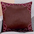 One of the design magazines, I think it's House Beautiful, has a feature that's titled "Why Don't You...." that offers some fun suggestions of things to try in your home. These aren't major investment items but instead small things that add a little flavor to what you've already got going on. Well, in the interest of avoiding a possible intellectual property conflict, I've tweaked it a bit. For instance, you know what you should try? Something purple. 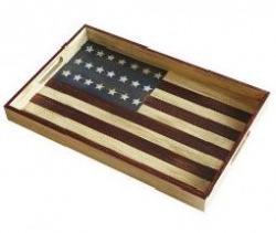 Flag tray from Target for $15 There's just something about this time of year that practically forces us to embrace decorating with Old Glory. Perhaps it's because you've got Memorial Day, Flag Day and July 4th, all within a 6 week span. Or maybe it's because some people think summer and think crisp beachy Nantucket style. Whatever the reason, the kick off to summer always coincides with a bit of red, white and blue. |
AuthorChristine Schwalm is an Interior Designer and Visual Merchandiser based in Los Angeles. This space will keep you updated on what's going on with CSD along with some ideas to inspire you. Go here for more information about pricing and services and here to make an appointment. Archives
January 2017
Categories
All
|