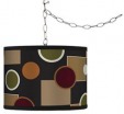
 Most everyone has that dark corner in their home that would seriously benefit from a bit of light. Chandeliers, much like area rugs, are fantastic for creating dedicated settings in your home. They provide intimacy over a dining table that general overhead lighting just can't.
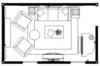
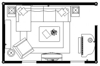
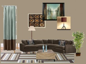
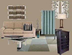 I wanted to fill you all in on some of the details of the latest project I'm working on. One part of the project is a full design consultation for the living room--floor plans, furniture recommendations, accessories, etc. The other part was more accessory and organization consultation for the home office. For this project, the clients wanted a design plan that addressed their needs. I've included a few pictures from the design portfolio I delivered to them this week. I'll focus on the living room in this entry and save the home office for next time. The main goal for the living room was to create a welcoming and comfortable space. The room is used primarily for watching TV (and enjoying the occasional snack). The clients also wanted something that showed some of their personality--so their family and friends would stop teasing them. After talking with them, I found that "non-boring" neutrals and blues were favored--though they were open to a few shots of bright color. As always, I start with the floor plans. I've included two of the proposed plans here. The first one offers a nice amount of seating while still taking into account the primary usage of this room--TV watching. The largest seating is on the longest wall and across from the television. Behind the chairs, on the left wall, I recommend some open bookcases or etageres for display. This room needs height and since that's the first wall you see upon entering the room, it needs to have impact. The two chairs in front can share an ottoman that can be moved around as necessary. The second plan features a chaise sectional instead of a sofa. This allows both clients to stretch on comfortably together. There's still room for a chair in the corner that is perfect for reading with the addition of an adjustable floor lamp. You'll notice the piano on the right side of the of the room. Right now, the piano is currently in the office but it's much more at home in this space. That area is not ideal for seating since it is a bit too far from the main conversation area and the TV can not be viewed clearly. As far as the actual pieces in the room, I kept the big (expensive) things more neutral and added color with window treaetments, art and accessories. For an area rug, I suggest FLOR carpet tiles. They're easy to maintain and if one gets ruined, just pop it out and replace with a new one. Ideal for my clients who have a (naughty) cat. If you're not familiar with FLOR tiles, check them out. They come in a variety of colors and textures and can be used to make a custom size rug.
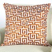
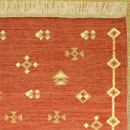
The clients will work on their own to complete this project but I'll check in again once it's complete and post the "after" pictures here. 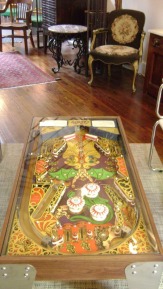 This is one of those things that are just too funny, kooky, and cool not to share. At a store called Paradiso in Hampden, Maryland, there was not one, but two pinball coffee tables. Be honest, every guy you know would want one of these in their house somewhere. it's sort of like the foosball table in Joey and Chandler's apartment on Friends,but far more useful since it has a glass top. 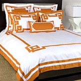 One of my favorite colors tends to get a bad rap. Yes, not everyone can appreciate the beauty of orange. I get it. Sometimes a "punch of color" can feel like a smack in the face; but there's no need to avoid orange. Especially when it has the ability to add so much life to a room. And, for you trendsetters, it's going to be a very popular color come fall. 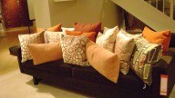 Let's start with some things to avoid. Orange really does not play nicely with black--except on Halloween. A better alternative is brown or grey. With brown, don't go adding too much gold to the palatte or you run the risk of having a very "Harvest-y" look. You don't want Halloween every day, but you don't want Thanksgiving either. The grey is bit more unexpected but a charcoal grey sofa with a few orange pillows (like the ones here from Room and Board) would look fantastic. 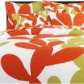 Another thing to watch out for: orange with other bright colors. It's fun and playful, but it can also read a little harsh. Know that if you pair bright colors like this with white, it's better to do it mostly in solids or cleaner patterns (like a stripe). A combination of bright color + busy pattern grows old very quickly. 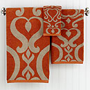 Orange also pairs really well with navy, cream, and tan. A bathroom with simple tan or cream tiles "wakes up" with just a couple of additions on orange--hand towels, tray to corral soaps, etc. I've included a few other other fun orange accents to inspire you below. 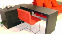 Now that I'm doing more work from home, I've decided that I no longer want to work on 1/2 of my dining room table. It's time for a proper home office--a small, but proper home office. 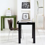 I'm in the market for something a little cleaner, less fussy, to accomodate my laptop. Something that I can add some shelving and/or a bulleting board above to keep supplies handy. The first picture is from Ligne Roset. Very chic, very elegant, very expensive. This one here is the ubiquitous desk from West Elm. 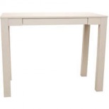 I have seen that desk in so many designer rooms, it's crazy. I checked it out in person once and while it has a pretty lacquer finish, I didn't fall in love. Now, in fairness, I've recently begun a bit of a flirt with Mid Century Modern furnishings so I'm pushing myself to move away from wood. This desk here, a close relative of the West Elm desk, is from........wait for it.......Walmart. I know! 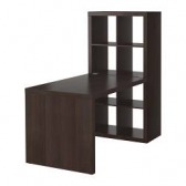 One last desk that caught my eye is this one here from Ikea. I like the attached storage, especially since it's got a graphic feel. Plus,they make doors for the cubbies to hide some of the less fabulous parts that come with having a home office. My guests do not need to see the accroutrements that go into making rooms pretty. 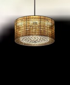 While walking down Wooster Street a month or so back, I walked into a beautiful showroom, Moura Starr. The chandeliers there are stunning, reminiscent of couture jewelry. It's more Harry Winston than Home Depot. One fixture that caught my eye was this one-shirred chiffon over crystal. 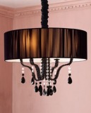 As I browsed around in other stores that day, I noticed other versions of the chiffon overlay shade. This black one here is interesting because of the addition of black crystal drops. I'm not a huge fan of that ruched chain cover. It's kind of dated looking. 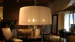 This fixture is from Crate and Barrel. I like the clean, unadorned look of this one. The secret to keeping it looking great is to use lower wattage bulbs or frosted bulbs. With a sheer shade, you don't want bright beams of light, you want a soft glow. Higher wattage bulbs also bring the risk of "browning" such a delicate shade. Browning=good for meat but bad for chandelier shades. 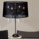 Even Costco (no, really!) gets into the act with their sheer shade/crystal lamp here. At $129, it's an affordable option that still brings some serious glamour. 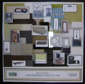 Ever watch those design shows and see those boards with pictures of furniture and fabric samples? Those are known as concept boards and they're supposed to be a snapshot of the finished space. So imagine my delight as a designer when I checked into the Holiday Inn down in Baltimore to see a one for the room where I was staying. 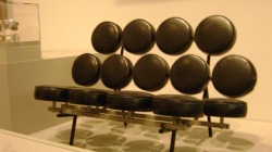 A few weeks ago I headed down to Baltimore with some friends to check out the city. I knew there would be great baseball and tasty crab dishes (soft pretzel + crabmeat + cheese= a reason to have tastebuds), but I didn't know there was such a thriving art and design culture down there. What a pleasant surprise to find so many interesting places to explore. I'll share some of the fantastic shops in upcoming entries but today is all about the art museum. It's a short cab ride from the inner harbor, but what you spend on cab fare you make up with free admission to the museum. 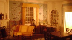 My favorite exhibits, by far, were the miniature rooms. Think dollhouse furniture but on a whole other level. The fact that most of them feature Federalist style furniture, a personal favorite, didn't hurt. They were just so clever! 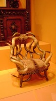 The museum features a beautiful selection of cabinetry, silver and textiles. It's just big enough to have a nice variety, but small enough to cover in one trip. Plus, it's a great way to get out of that Baltimore humidity for a few hours! |
AuthorChristine Schwalm is an Interior Designer and Visual Merchandiser based in Los Angeles. This space will keep you updated on what's going on with CSD along with some ideas to inspire you. Go here for more information about pricing and services and here to make an appointment. Archives
January 2017
Categories
All
|

 RSS Feed
