
| Christine Schwalm Design |
|
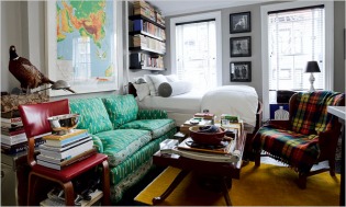
 There are many schools of thought on what makes for tasteful design. At either end of the spectrum is the "less is more" and the "more is more". Today's NY Times features the home of a young designer who clearly subscribes to the latter school of thought. It's a tiny apartment in Brooklyn that is chock full of collectibles, books and assorted items. Here's my issue--there's virtually nowhere for the eye to rest--especially in the living area. My eye went straight from the plaid throw on the chair to the simple (and quite lovely) white bedding. Why? Because that sofa pattern hurt my eyes! The room, in my opinion would be much more appealing with either a charcoal grey sofa, perhaps in a wool or linen or something in leather.  That said, there are several pieces that work really well. For instance, I love the plaid throw against the yellow area rug--very fun. And the kitchen island that the designer built is both well thought and nicely executed. I don't get the green wall behind it (why draw attention to this area?)....but that's the least of it. I don't like homes that don't show any of the resident's personality, but I do believe that you don't need to have all your "personality" on display all the time. As my mother likes to say, a little mystery never hurt anyone. Comments are closed.
|
AuthorChristine Schwalm is an Interior Designer and Visual Merchandiser based in Los Angeles. This space will keep you updated on what's going on with CSD along with some ideas to inspire you. Go here for more information about pricing and services and here to make an appointment. Archives
January 2017
Categories
All
|