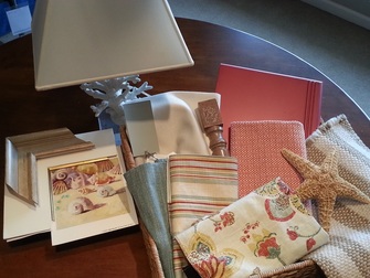
I wanted to share a few pictures for a room setting I'm working on. It's for my showroom in the Hamptons. We've already got the Nantucket look covered out there and it's very popular. I wanted to bring in something a little more Bermuda. By that, I mean moving away from the more traditional nautical look of blue and white, instead integrating bright pops of color. The main pieces will be fairly neutral (ivory sectional, light wood coffee table and media unit) to stay in line with what actual clients would choose to do in their own home--and to keep all of the pieces useful for the designers to use.
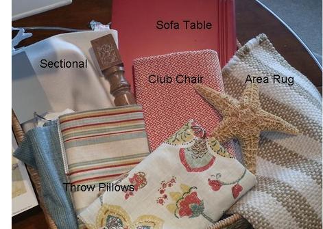
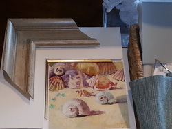
If you're thinking, "a white sectional?!" don't worry, I chose an indoor/outdoor performance fabric that's designed to withstand some abuse. The paint color is a favorite from my days back Stamford-Benjamin Moore Classic Colors 1557 Silver Song. It's got a great chamelon quality that makes it work beautifully in so many rooms. A striped rug in neutral tones lets the bright pillows and coral fabric for the chair shine. A few pieces of custom art, like this one here, hung over the sectional will tie the look together beautifully. I'll share pictures once it's all installed.
 RSS Feed
