Christine Schwalm Design
  • Home
  • About CSD
  • Services
  • Portfolio
  • Contact CSD
  • Testimonials

Fresh and bright

1/4/2013

 
Picture
It's time once again for some changes in the showroom where I spend my days.  I'm lucky that my location is a bit larger so I have a little more flexibility. 

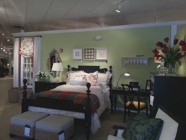
I pulled this bedroom together using black furniture with lots of cream and tan fabrics to keep it from getting too heavy.  A few bright splashes of color, inspired by the floral fabric on the windows (detailed shot below) and pillows, keep it lively.


Read More

Chic entry table

8/3/2011

 
Picture
As part of the day job, I merchandise two locations.  For the smaller location, I knew the lobby needed a little extra something to dress the space but still needed to be useful.  I found some inspiration in an issue of Traditional Home a while back that provided the perfect solution.  

I used a 48" round (though a 36" or 30" round would also work well) table and some ottomans tucked underneath to create a welcoming entry table.  Some tall accessories draw the eye up and add some drama.  If you live in an apartment, a table like this, especially if it comes with leaves would be great for entertaining.  Pull some attractive folding chairs out of the closet and dine in style. 

Workshop Recap

8/28/2010

 
Picture
If you weren't able to attend the workshop on the 15th, you missed a great event!  I walked attendees through different options for addressing their walls and explained some tips and tricks that I use to hang items safely.  Several brought pictures of their rooms which we scanned and added items in digitally.  It was a John Madden moment for me. 

In other news related to the "day job," I'll be transferring to the Long Island district in November so if you live in Stamford and have been considering CSD services, now is the time to make an appointment. 

A buffet of color

3/2/2010

 
Picture
As you may have heard, color authority Pantone has christened turquoise as the 2010 color of the year.  I wanted to share a decidedly cool representation of turquoise currently on display in the front lobby of the day job designed by the folks at HQ.  It's ikat, which I think has only a few minutes left on the current style clock, but the miter square pillow makes it irresistable.  And lest the other colors of the rainbow feel slighted, the rest of the lobby is a shout out to chartreuse, magenta and orange.  I don't care what Pantone says, I love you colors all equally.


Read More

Redesign Projects-Updated!

1/21/2010

 
Picture
I updated the Redesign Projects section of my Portfolio to include an accessory homecall I did today with a designer I work with at the day job.  The client had some great pieces but the room felt a little bland.  Some items she owned were not being shown off to their fullest potential and other areas lacked color and interest.  This simple redesign shows how just a few additions can make a big difference.

Color combination-grey, yellow, and cream

12/17/2009

 
Picture
As promised, I wanted to do an entry that went through the 2nd new vignette I added to the Portfolio section last week.  This one is also adapted from a stunning showhouse room put together by the very talented design team in my corporate office.  Again, they were working in a much larger space (5x what you see here) so I was tasked to pick the right pieces that would both suit the space and appeal to clients.


Read More

Design dilemma: one long room, 2 wall colors

12/15/2009

 
Picture
As open floor plans become even more popular, homeowners are faced with the question of how to paint more than one color on the walls.  Very frequently, there is no clear break between, let's say, a living room and a dining room.  Your best bet is to work with an existing architectural element like a doorway to provide a more natural break.  But even if there is a doorway, that leads either down a hall or to another room, it most likely doesn't extend up to the ceiling.  What I do here in the showroom is paint the area directly above the door going all the way to ceiling the same color as the trim.  It provides the necessary visual separation without drawing too much attention.  Keep in mind this works best when the two paint colors are comparable in intensity and/or hue. 

Retail Projects-Updated!

12/7/2009

 
Picture
I added two new room settings that I did for the day job to the Retail Projects section of my portfolio.  You may notice as you click through that one room looks familiar.  I moved a living room setting from a larger to a smaller space.  For those of you planning to move (or who have recently moved), this will give you some ideas about repurposing your existing pieces.  For instance, the artwork over the sofa used to be above the bed.  It's important to rethink your items as your needs and lifestyle changes.  I'll go through both new settings more thoroughly in upcoming entries to give you insight into the design rationale I used to complete the projects.

Pulling it together

11/24/2009

 
Picture
There are lots of great ideas to take away from the new room setting I did for the day job.  First, using 2 smaller scale sofas facing each other is perfect for creating balance.  This is set up works great if you've got 2 focal points across from each other (fireplace/window and TV).  The sofas here are in a neutral khaki which is the perfect backdrop for the red pillows and artwork.  Think of it like wearing a tan coat with a red scarf.


Read More

Retail Projects--updated

11/23/2009

 
Picture
I updated the Retail Projects section to show a new room vignette.  It features one of my favorite color combinations--red, black and tan.  It's gender neutral, stylish and easy to integrate into just about any space.  Think about the clothes in your closet.  I bet there's a fair amount of black and tan in there.  A few accents of red (high heels, a tie--probably not both) are easy to work in to add some interest.  There's lots of great ideas in this space.  I'll break it down in the next entry to give you ideas you can adapt into your home.

<<Previous

    Author

    Christine Schwalm is an Interior Designer and Visual Merchandiser based in Los Angeles.  This space will keep you updated on what's going on with CSD along with some ideas to inspire you.  Go here for more information about pricing and services and here to make an appointment. 
     
    Have a design question?  Need some advice?  Send it here and I'll post the answer in an entry.

    Follow @cmschwalm

    RSS Feed

    Archives

    January 2017
    November 2016
    October 2016
    September 2016
    August 2016
    July 2016
    June 2016
    May 2016
    April 2016
    March 2016
    December 2013
    November 2013
    October 2013
    August 2013
    June 2013
    May 2013
    February 2013
    January 2013
    September 2012
    August 2012
    July 2012
    June 2012
    May 2012
    April 2012
    March 2012
    December 2011
    October 2011
    August 2011
    July 2011
    May 2011
    April 2011
    March 2011
    February 2011
    January 2011
    December 2010
    October 2010
    September 2010
    August 2010
    July 2010
    June 2010
    May 2010
    April 2010
    March 2010
    February 2010
    January 2010
    December 2009
    November 2009
    October 2009
    September 2009
    August 2009
    July 2009

    Categories

    All
    Accessories
    Ad Home Show
    Art Museum
    Baltimore
    Brooklyn
    Cleveland
    Color
    Craigslist
    Day Job
    Design Question
    Detroit
    Fallingwater
    Field Trip
    Flea Market
    Furniture
    Garden
    Get On It
    Holiday
    Ikea
    Inspiration
    Inspriation
    Kansas City
    Lighting
    Lodgings
    Movies
    New Blog
    Ny Times
    Pattern
    Payments
    Paypal
    Philadelphia
    Project
    Redesign
    Showroom
    Target
    Thumbs Down
    Trends
    West Elm

Powered by Create your own unique website with customizable templates.