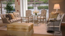
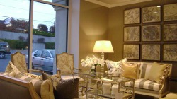
- The color palatte of grey, cream and yellow is something we're more used to seeing in a modern space.
- Two nickel and glass tables used between the sofas instead of a more traditional coffee table.
- Accessories like a white shag rug, a crystal block lamp and a grid style grouping of art that are appropriate but more contemporary.
- Bold patterns like the grey/white stripe on the settees
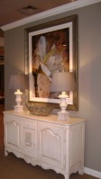
As promised, I wanted to do an entry that went through the 2nd new vignette I added to the Portfolio section last week. This one is also adapted from a stunning showhouse room put together by the very talented design team in my corporate office. Again, they were working in a much larger space (5x what you see here) so I was tasked to pick the right pieces that would both suit the space and appeal to clients. First off, can we just ooh and ahh over this color palatte for minute. So fresh, so elegant. And this chair may be the most beautiful thing ever made by the company I work for. So the original space had 2 large seating areas and a library/entry area. I chose 2 settees on purpose to mirror the display on the other side of the building--except this one is much more formal. But even though it's formal, it's not stuffy and here's why. One quick note on the artwork. Originally, the large floral was over the settees but I quickly realized I had to make a change. It just dwarfed the settee horribly. But if you look carefully, you'll see that the grid as a whole is even larger. Why does this proportion work? Well, several small items (9 in this case) that are tonally similar to the wall color, hung in a precise grid, are easier for the eye to read. So even though it's larger, it feels smaller.
Comments are closed.
|
AuthorChristine Schwalm is an Interior Designer and Visual Merchandiser based in Los Angeles. This space will keep you updated on what's going on with CSD along with some ideas to inspire you. Go here for more information about pricing and services and here to make an appointment. Archives
January 2017
Categories
All
|