
| Christine Schwalm Design |
|
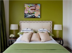
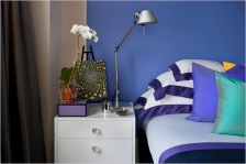
 Please pardon the brief absence. I've been quite busy with the day job and the apartment hunt (apartment #1 fell through creating all sorts of challenges). But I wanted to share some great pictures from an article in the New York Times.The designer who lives here is renting while his permanent home is being built nearby. He wanted to create something that didn't feel temporary but didn't require a huge investment of time or effort. Note in the picture above how the wall area surrounding the bed is painted in the same green as the bedding to create a stronger focal point. The same green is in the artwork, too. (I'm not sure why it's hung off center. That's usually done to balance out an architectural element like a window or column.) Matching tables and lamps also reinforce the focal point.  The same technique is used in this bedroom to pop the color in the bedding. On both focal walls the paint color does not cover the entire wall. There is about a 6 inch border used to provide some relief. Just bring your bedding to the paint store and do a color match of either the main or accent color. Whether you're renting or you own, it's easy to add emphasis with color. Comments are closed.
|
AuthorChristine Schwalm is an Interior Designer and Visual Merchandiser based in Los Angeles. This space will keep you updated on what's going on with CSD along with some ideas to inspire you. Go here for more information about pricing and services and here to make an appointment. Archives
January 2017
Categories
All
|