
| Christine Schwalm Design |
|
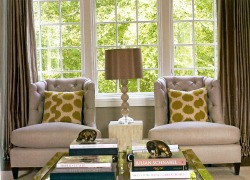
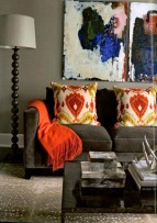
 Dovecote Design Perhaps it's because of the recent project I completed, but I'm noticing more grey being used by designers. And not just with pale blue as part of that "icy chic" look--which, frankly, is overdone at this point. In this picture it's mixed with chartreuse (that's the fancy way to say bright green) for a fresh look. Over the summer, I stopped into Lignet Roset's showroom where they had grey paired beautifully with lilac, orchid and some white lacquer pieces.  Dovecoat Design Darker grey is also fantastic with bright colors. like the orange seen here. (And finally, an ikat print I can get behind--just on pillows!) You can see that unlike the first picture, the grey used here is a little bit warmer with some brown undertones. The grey in the first picture is "cooler" which pairs really well with the green. This picture happens to also be a great example of what I discussed in the previous entry: using the same wall and upholstery color. See how the sofa is just a tone darker than the wall color? The two work together to provide a clean backdrop to the art and accessories. Comments are closed.
|
AuthorChristine Schwalm is an Interior Designer and Visual Merchandiser based in Los Angeles. This space will keep you updated on what's going on with CSD along with some ideas to inspire you. Go here for more information about pricing and services and here to make an appointment. Archives
January 2017
Categories
All
|