Christine Schwalm Design
  • Home
  • About CSD
  • Services
  • Portfolio
  • Contact CSD
  • Testimonials

Design dilemma: one long room, 2 wall colors

12/15/2009

 
Picture
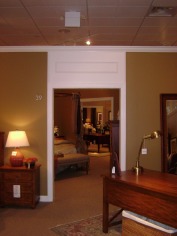
As open floor plans become even more popular, homeowners are faced with the question of how to paint more than one color on the walls.  Very frequently, there is no clear break between, let's say, a living room and a dining room.  Your best bet is to work with an existing architectural element like a doorway to provide a more natural break.  But even if there is a doorway, that leads either down a hall or to another room, it most likely doesn't extend up to the ceiling.  What I do here in the showroom is paint the area directly above the door going all the way to ceiling the same color as the trim.  It provides the necessary visual separation without drawing too much attention.  Keep in mind this works best when the two paint colors are comparable in intensity and/or hue. 

Inspiration-complimentary color scheme

12/1/2009

 
Picture
I saw these pictures in the November issue of House Beautiful and they really struck a chord with me.  I think it was the combination of elements that I like so much.  First off, the green/red complimentary color scheme (which I have in my own apartment) is terrific.  The bright apple green gives so much life.  Second, that Jacobean floral fabric is fantastic.  It's the type of thing that can only be used in small doses or it will completely overwhelm a space.  Third, those glasses!  They have sort of an animal print feel to them and it just adds a lot of warmth.  Lastly, the table is such a great blend with Phyfe inspired pedestal legs but a Mid Century modern teak color finish.


Read More

Pulling it together

11/24/2009

 
Picture
There are lots of great ideas to take away from the new room setting I did for the day job.  First, using 2 smaller scale sofas facing each other is perfect for creating balance.  This is set up works great if you've got 2 focal points across from each other (fireplace/window and TV).  The sofas here are in a neutral khaki which is the perfect backdrop for the red pillows and artwork.  Think of it like wearing a tan coat with a red scarf.


Read More

Retail Projects--updated

11/23/2009

 
Picture
I updated the Retail Projects section to show a new room vignette.  It features one of my favorite color combinations--red, black and tan.  It's gender neutral, stylish and easy to integrate into just about any space.  Think about the clothes in your closet.  I bet there's a fair amount of black and tan in there.  A few accents of red (high heels, a tie--probably not both) are easy to work in to add some interest.  There's lots of great ideas in this space.  I'll break it down in the next entry to give you ideas you can adapt into your home.

Effective design with neutrals

11/18/2009

 
Picture
I wrote the other day about using color to reinforce a focal point within a room.  But that much color is not for everyone.  There's a reason why tan, off white and beige are the most popular colors for paint and upholstery--people like them (or are afraid of the alternative).  There are a few tricks to making a neutral room work. 


Read More

Creating emphasis-on the cheap

11/16/2009

 
Picture
Please pardon the brief absence.  I've been quite busy with the day job and the apartment hunt (apartment #1 fell through creating all sorts of challenges).  But I wanted to share some great pictures from an article in the New York Times.The designer who lives here is renting while his permanent home is being built nearby.  He wanted to create something that didn't feel temporary but didn't require a huge investment of time or effort. 


Read More

Cube to Dinner for 4

10/31/2009

 
Picture
Problem: You live in a tiny apartment and don't invite friends over for meals because there's no space for a table.

Solution: The Packet Table from Pure Design.

Picture
Is it the most comfortable seating?  No, but it doesn't pretend to be.  This isn't meant for a fine dining experience.  It's able to go from 25"x25" footprint to up to tabletop surface for 4 (43"x43").  It would be terrific as an end table, laptop table or for eating.  You have a choice of white, charcoal or orange for both the table and chairs.  So cute.

Classic or overdone?

10/21/2009

 
Picture
Designer Daryl Carter's dining room
When does something stop being classic and start being trendy?  After all, we'd all like to invest in furniture that qualifies as classic--especially expensive furniture.  But lately, I feel like I keep seeing the same things in shelter magazines--linen, mohair, neutral colors  like grey or mushroom, weathered woods and nickel are just a few examples.  It used to be that I'd consider furniture with these features classic; Belgian linen drapes in a stormy grey, mohair sofas in a soft mushroom brown or an old farmhouse style table that's clearly been "loved."


Read More

Pattern breakthrough-Suzani

10/7/2009

 
Picture
I am, generally speaking, a linear gal.  I have quite the collection of striped button down shirts for work and a penchant for argyle that borders on shameful.  My interior design taste, fortunately, makes room for paisley and florals.  Not giant cabbage roses (though if that's what you want, I'll make it look great), but a more modern intrepretation of florals. 

Picture
This is why I find Suzani textiles so appealing.  The word derives from Uzbekistan in Central Asia and means needle.  Traditional suzanis were large embroidered textiles in floral or plant motifs, given as dowries upon marriage. There's been a revival of these prints and now you can find them just about everywhere. 


Read More

Design Inspiration

9/10/2009

 
Picture
I started paging through this month's House Beautiful over lunch today and stopped 4 pages in when I saw this ad from Lee Jofa. It features their "Nolita" collection from the Groundworks division.  Groundworks is the more contemporary fabric offering from Lee Jofa.  A few things drew me in to this ad.  First off, a delicious medley of fantastic colors--I love orange and purple together.  Second, can we talk about the velvet?  I won't lie, I'm a big fan.  Not as bad as George Costanza, wanting "to drape myself in velvet," but a fan all the same.  Nothing says autumn quite like it. 

Picture
Third is the great mix of pattern.  There's a large scale floral, a geometric, a mini print and some solids.  The largest print has the entire color palatte and all of the supporting fabrics relate to it.  Notice, too, the way the curve of the headboard repeats the curve of the floral motif.  I would love to have seen more of the geometric pattern, perhaps on a larger pillow, to balance out the floral pattern a bit more.  Geometrics and stripes have more staying power because they're easier for the eye to read.  Still, this ad is absolutely getting posted on my inspiration board.  Right next to my picture of Tim Gunn reminding me to "make it work."

<<Previous
Forward>>

    Author

    Christine Schwalm is an Interior Designer and Visual Merchandiser based in Los Angeles.  This space will keep you updated on what's going on with CSD along with some ideas to inspire you.  Go here for more information about pricing and services and here to make an appointment. 
     
    Have a design question?  Need some advice?  Send it here and I'll post the answer in an entry.

    Follow @cmschwalm

    RSS Feed

    Archives

    January 2017
    November 2016
    October 2016
    September 2016
    August 2016
    July 2016
    June 2016
    May 2016
    April 2016
    March 2016
    December 2013
    November 2013
    October 2013
    August 2013
    June 2013
    May 2013
    February 2013
    January 2013
    September 2012
    August 2012
    July 2012
    June 2012
    May 2012
    April 2012
    March 2012
    December 2011
    October 2011
    August 2011
    July 2011
    May 2011
    April 2011
    March 2011
    February 2011
    January 2011
    December 2010
    October 2010
    September 2010
    August 2010
    July 2010
    June 2010
    May 2010
    April 2010
    March 2010
    February 2010
    January 2010
    December 2009
    November 2009
    October 2009
    September 2009
    August 2009
    July 2009

    Categories

    All
    Accessories
    Ad Home Show
    Art Museum
    Baltimore
    Brooklyn
    Cleveland
    Color
    Craigslist
    Day Job
    Design Question
    Detroit
    Fallingwater
    Field Trip
    Flea Market
    Furniture
    Garden
    Get On It
    Holiday
    Ikea
    Inspiration
    Inspriation
    Kansas City
    Lighting
    Lodgings
    Movies
    New Blog
    Ny Times
    Pattern
    Payments
    Paypal
    Philadelphia
    Project
    Redesign
    Showroom
    Target
    Thumbs Down
    Trends
    West Elm

Powered by Create your own unique website with customizable templates.