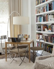
 image courtesy House Beautiful Most of us tend to use our living rooms for television watching. And that's fine--I do it. But we can all agree that there's a lot more to living than watching TV. When you visit museums you'll see one common feature in historical living rooms is the game table. (Maybe that's not the first exhibit you check out....) Back then, the main form of entertainment was a rousing game of chess or cards. I'm happy to see a resurgence of game tables in all different styles.
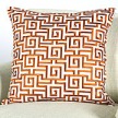
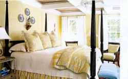 image courtesy Traditional Home There's a scene in that movie "Along Came Polly" where Ben Stiller's character calculates the amount of time he spends removing and replacing the decorative pillows on the bed over the course of his lifetime and then promptly freaks out. I imagine most men feel this way, but pillow "murder" is hardly the answer. There is a better way. 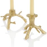 A perfect housewarming gift Fisherman will tell you that to get a good haul you need to know where to go and cast a wide net. In that sense, it's not too different from interior design. Always on the lookout for affordable and stylish items, I like to check out a variety of places. Hey, you never know where you'll find an unexpected and cool treasure--though those people who have parents and grandparents with attics ridiculously full of great pieces irritate me to no end. 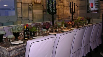 Benjamin Moore DIFFA table This weekend I hit up Design Nerd Expo '10--better known to laypeople as the Architectural Digest Home Show--and came away with lots of great ideas and sneak peeks into what's new out there. One element I saw consistently was the use of potted succulent plants grouped en masse as centerpieces. This works out perfectly for several reasons. 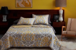 I shared one of the new room vignettes a few weeks ago that featured a charcoal grey and yellow palatte that is really stunning. The vine fabric....oh my! I know the Pantone folks are saying that turquoise is going to be the "it" color for this year, but I think yellow is going to be a contender. I was reading a favorite design blog last week that featured some of DwellStudio for Target's new line of bedding and pillows. 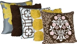 Check out the pillows that are part of the new line, too. That back one is fantastic. And the texture of the 2nd, with the roses, really great. Pillows are always an easy, low cost way to participate in a trend without going bankrupt. So, where have you seen grey and gold lately? 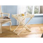 If you want to get a good deal (and not wind up with the same thing that everyone else has) you've got to travel a little off the beaten path. That means checking out flea markets, Salvation Army and craigslist. It also means checking out some stores that you would never normally consider for furniture. I wrote about that a little while ago (JC Penneys) and today I've got another surprise for you. This fretwork tray table is perfect for those of you wanting to inject a bit of that Hollywood Regency look into your home. Where to find this chic little table? Brace yourselves.......KMart. It only comes in the white finish, but at only $70 (on sale), you would be wise to get on this great deal right now! 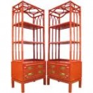 The Hollywood Regency design trend has been back with us for a minute, spearheaded by the likes of Jonathan Adler and Kelly Wearstler. It is a luxurious look that features high shine and glam details. While the original offshoot of Art Deco style worked around a palatte of blacks and creams, this recent revamp injects bright color. One landing spot for this color is on faux bamboo pieces, such as the Jonathan Adler etagere shown here.  Perhaps I am a bit late to the party, but have you all heard of Etsy? It's a fabulous website that features handmade work from artisans and craftsmen. After my "scolding" a few weeks ago about mass marketed antiques, I thought it only fair to provide an alternative. 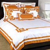 One of my favorite colors tends to get a bad rap. Yes, not everyone can appreciate the beauty of orange. I get it. Sometimes a "punch of color" can feel like a smack in the face; but there's no need to avoid orange. Especially when it has the ability to add so much life to a room. And, for you trendsetters, it's going to be a very popular color come fall. 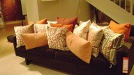 Let's start with some things to avoid. Orange really does not play nicely with black--except on Halloween. A better alternative is brown or grey. With brown, don't go adding too much gold to the palatte or you run the risk of having a very "Harvest-y" look. You don't want Halloween every day, but you don't want Thanksgiving either. The grey is bit more unexpected but a charcoal grey sofa with a few orange pillows (like the ones here from Room and Board) would look fantastic. 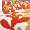 Another thing to watch out for: orange with other bright colors. It's fun and playful, but it can also read a little harsh. Know that if you pair bright colors like this with white, it's better to do it mostly in solids or cleaner patterns (like a stripe). A combination of bright color + busy pattern grows old very quickly. 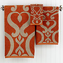 Orange also pairs really well with navy, cream, and tan. A bathroom with simple tan or cream tiles "wakes up" with just a couple of additions on orange--hand towels, tray to corral soaps, etc. I've included a few other other fun orange accents to inspire you below. |
AuthorChristine Schwalm is an Interior Designer and Visual Merchandiser based in Los Angeles. This space will keep you updated on what's going on with CSD along with some ideas to inspire you. Go here for more information about pricing and services and here to make an appointment. Archives
January 2017
Categories
All
|

 RSS Feed
