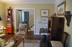
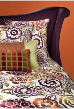
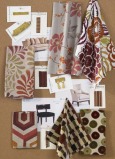
I updated the Retail Projects section to show a new room vignette. It features one of my favorite color combinations--red, black and tan. It's gender neutral, stylish and easy to integrate into just about any space. Think about the clothes in your closet. I bet there's a fair amount of black and tan in there. A few accents of red (high heels, a tie--probably not both) are easy to work in to add some interest. There's lots of great ideas in this space. I'll break it down in the next entry to give you ideas you can adapt into your home.
I'm frequently asked about my own personal design style and how it permeates into my projects. Well, let's take the second question first--my style has no place in your house. Unless it happens to be your style. And that almost never happens. Today, while perusing Apartment Therapy, I saw a slideshow from a home that I would very happily call my own. Please pardon the brief absence. I've been quite busy with the day job and the apartment hunt (apartment #1 fell through creating all sorts of challenges). But I wanted to share some great pictures from an article in the New York Times.The designer who lives here is renting while his permanent home is being built nearby. He wanted to create something that didn't feel temporary but didn't require a huge investment of time or effort. A few weeks ago, I took a trip out to the wineries on the North Fork of Long Island for the day with my parents and sister. At this point, there's nothing Mom really needs for her birthday--but everyone wants a solid day of food, laughs and wine. Fall is the perfect time to make the trip out and after a few attempts, we finally wound up at Raphael Vineyards.
I had to do a second entry on the flea market because there was just too much good stuff to share. Like these lamps, for instance. They would great with a simple round shade (no trims) in a room painted a deep color (maybe a peacock blue?) so the white base really pops. One note, matching lamps work best on end tables that are the same height to create a more cohesive look. These would also work on a console or dresser, too. I decided to take advantage of the beautiful weather yesterday and took a trip over to the outdoor flea market in Hell's Kitchen to do a bit of browsing. I was pleasantly surprised by all the treasures I found there. First off, ladies, if you are looking for jewelry (costume)--this is the spot! But I was looking for some things for the home. These antique keys here could be framed in shadowboxes, for a less expensive version of what you can find at Ballard Design. I am, generally speaking, a linear gal. I have quite the collection of striped button down shirts for work and a penchant for argyle that borders on shameful. My interior design taste, fortunately, makes room for paisley and florals. Not giant cabbage roses (though if that's what you want, I'll make it look great), but a more modern intrepretation of florals. This is why I find Suzani textiles so appealing. The word derives from Uzbekistan in Central Asia and means needle. Traditional suzanis were large embroidered textiles in floral or plant motifs, given as dowries upon marriage. There's been a revival of these prints and now you can find them just about everywhere. This Sunday I plan on combining my love of design and love of a good bargain by checking out the Metropolitan Home Showtime House. The rooms are all inspired by programs on Showtime-Dexter, Weeds, Californication, etc. Those of you who are not fellow design nerds but just love some quality television programming can also appreciate this showhouse. I started paging through this month's House Beautiful over lunch today and stopped 4 pages in when I saw this ad from Lee Jofa. It features their "Nolita" collection from the Groundworks division. Groundworks is the more contemporary fabric offering from Lee Jofa. A few things drew me in to this ad. First off, a delicious medley of fantastic colors--I love orange and purple together. Second, can we talk about the velvet? I won't lie, I'm a big fan. Not as bad as George Costanza, wanting "to drape myself in velvet," but a fan all the same. Nothing says autumn quite like it. Third is the great mix of pattern. There's a large scale floral, a geometric, a mini print and some solids. The largest print has the entire color palatte and all of the supporting fabrics relate to it. Notice, too, the way the curve of the headboard repeats the curve of the floral motif. I would love to have seen more of the geometric pattern, perhaps on a larger pillow, to balance out the floral pattern a bit more. Geometrics and stripes have more staying power because they're easier for the eye to read. Still, this ad is absolutely getting posted on my inspiration board. Right next to my picture of Tim Gunn reminding me to "make it work." |
AuthorChristine Schwalm is an Interior Designer and Visual Merchandiser based in Los Angeles. This space will keep you updated on what's going on with CSD along with some ideas to inspire you. Go here for more information about pricing and services and here to make an appointment. Archives
January 2017
Categories
All
|